

- A clear guide to using Bitcoin liquidation heatmaps to spot liquidity traps, predict sharp moves, and improve your BTC trading strategy.
The Bitcoin market moves at lightning speed, and leveraged trading only magnifies the risk. A sudden 5% shift can trigger a cascade of forced liquidations, turning minor corrections into violent flash crashes.
But what if you could see these danger zones before they’re triggered? Enter the Bitcoin liquidation heatmap, a powerful visual tool that maps these liquidation clusters, serving as an early warning system for volatility and a roadmap to genuine supply and demand levels.
In 2025, this tool has evolved from a niche chart for derivatives traders to an indispensable part of the toolkit for both retail and institutional participants, offering a forward-looking view of market risk.
What is a Bitcoin Liquidation Heatmap?
A Bitcoin liquidation heatmap is a visual trading tool that identifies price levels where large clusters of leveraged long or short positions are at risk of being automatically closed by exchanges.
These “liquidation zones” represent hidden levels of future buying or selling pressure. When price approaches these clusters, it can trigger a chain reaction of forced liquidations, acting as a powerful accelerator for market moves.
Unlike traditional charts that show where price has been, a liquidation heatmap provides a probabilistic forecast of where volatility could erupt, making it essential for navigating today’s highly leveraged crypto markets.
Key Elements of a Modern BTC Liquidation Heatmap
To effectively use this tool, you must understand its core components, which have been refined with better data and AI integration in 2025.
- Liquidation Clusters as Hidden Support/Resistance: The most critical function of the heatmap is identifying price levels that will likely act as strong support or resistance. A dense cluster of long liquidations below the current price represents a potential “selling wall.” If hit, the forced selling could crash the price further. Conversely, a cluster of short liquidations above the market represents a “buying wall” of potential forced buy-backs that could rocket the price higher.
- Color Intensity and Market Depth: The heatmap uses a color spectrum (often from cool blues to intense reds and whites) to represent the density and dollar value of liquidations at each price level. A bright white or deep red zone indicates a massive liquidation cluster, a potential epicenter for future market volatility.
- The Time Dimension and Dynamic Flow: Advanced heatmaps in 2025 are no longer static. They show how these liquidation zones build up or dissipate over time, providing insight into shifting market sentiment and the changing risk landscape throughout a trading day or week.
How To Use the Bitcoin Liquidation Heatmap?
- Identify Liquidation Walls:
Bright zones show where large clusters of long or short liquidations sit. These areas often act as hidden support or resistance. - Watch for Volatility Pockets:
When price moves into a dense cluster, liquidations can trigger a chain reaction. Expect fast moves in these areas. - Confirm Breakout Strength:
If price pushes through a liquidation wall, forced liquidations can amplify the move and confirm the breakout. - Avoid Dangerous Entries:
Check if your planned entry sits near a heavy cluster. If yes, wait—these zones often cause sharp whipsaws. - Track Shifts Over Time:
Heatmaps in 2025 update dynamically. Rising clusters show where new leverage is building, while fading zones reveal where traders are exiting. - Use With Other Indicators:
Pair the heatmap with spot volume, BTC dominance, or on-chain metrics to validate whether the move is healthy or purely liquidation-driven.
Simple rule:
If price is heading into a dense liquidation zone, expect movement. If it enters a gap, expect acceleration.
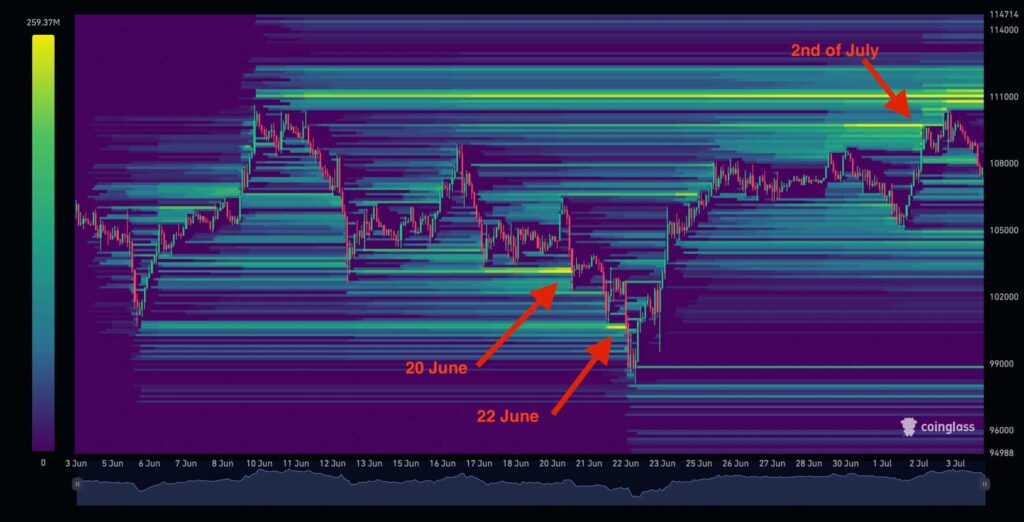
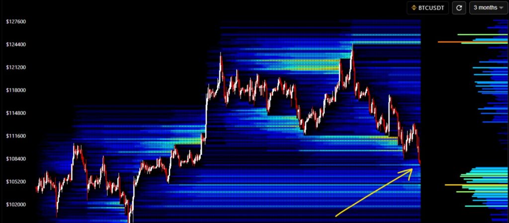
You can see in the heatmap above that Bitcoin moved directly into the yellow liquidation zone on June 20. It then dipped into the next major zone on June 22. Once those lower liquidations were cleared, the price shifted upward and targeted the next concentration of liquidity, eventually reaching the upper yellow zone by July 2. This shows how price often gravitates toward areas with the most liquidity.
Trading Strategy with a Liquidation Heatmap
1. Read the Heatmap First
Look at where the brightest zones appear on the chart. These areas show where the largest liquidation clusters sit. Price often gravitates toward these levels because that’s where the most leveraged positions are exposed.

2. Plan Smarter Entries and Exits
- Entries: Consider taking positions when price approaches a key liquidation zone, especially if it lines up with spot volume or a support level.
- Exits: If price is heading into a heavy cluster above, it can be a good spot to take profit or scale out before volatility spikes.
3. Manage Risk Like a Professional
- Use stop losses outside major liquidation pockets rather than directly inside them.
- Keep leverage low. The liquidation map highlights where overleveraged traders usually get trapped.
4. Keep the Map Open While Trading
Heatmap levels update frequently. New clusters can build quickly during volatile sessions, so monitor the chart and adjust positions as conditions change.
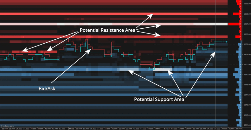
Understanding Support and Resistance on a Liquidity Map
A liquidity map makes support and resistance easier to spot by showing where large buy and sell orders are sitting in the order book. Heavy blue areas represent strong buy-side interest, which can act as support when price taps into them.
The red zones show concentrated sell liquidity, often forming resistance that slows or rejects upward moves. When price approaches these levels, it tends to react because this is where real market participants are waiting with significant orders. This helps traders anticipate turning points with more accuracy than traditional chart levels alone.
Conclusion: Key Takeaways From the Bitcoin Liquidation Heatmap
In summary, the Bitcoin liquidation heatmap is a practical tool that can strengthen your trading approach. By highlighting where large liquidation events are likely to occur, the heatmap helps you anticipate price movements with more confidence. These liquidity zones often act as magnets for Bitcoin’s price, making them useful markers for identifying support, resistance, and overall market direction.
When you pair liquidation heatmaps with other liquidity tools, such as buy and sell pressure heatmaps, you get a fuller picture of how market participants are positioned. The real value of these heatmaps lies in how they convert complex market data into simple, visual insights, something both new and experienced traders can rely on.
FAQs On Bitcoin liquidation heatmaps
Yellow areas = high liquidation risk. If price hits these zones, many leveraged traders may be forced out of their positions.
Blue areas = low liquidation activity.
The closer price moves toward a yellow zone, the higher the chance of a sharp move or a liquidation cascade.
They are very useful for spotting liquidation pressure, but they are not 100 percent accurate or predictive on their own. Some limitations include:
Lagging data: Feeds may update slightly late during heavy volatility.
Exchange-specific bias: Most heatmaps use data from a few exchanges, not the entire global market.
Whale manipulation: Large players can place or remove big orders to create misleading signals.
They reveal hidden risk zones, highlight potential reversal points, and help you avoid entering trades near liquidation clusters.
You can view them on platforms like Coinglass, Hyblock, and Overcharts, which offer real-time liquidation data.